Tailwind CSS Flex Direction : The CSS flexbox is a vital feature to develop the frontend, there are four directions available in CSS so in tailwind CSS all the properties are covered as in class form. It is the alternative of CSS flex-direction Property for fast development of front-end.
Tailwind CSS Flex Direction
Utilities for controlling the direction of flex items.
| Class | Properties |
|---|---|
| flex-row | flex-direction: row; |
| flex-row-reverse | flex-direction: row-reverse; |
| flex-col | flex-direction: column; |
| flex-col-reverse | flex-direction: column-reverse; |
flex-row: It arranges the row the same as the text direction. The default value of flex-direction is a row. It is used to specify that the item has a normal text direction. It makes the item follow the normal text direction in lines.
Use flex-row to position flex items horizontally in the same direction as text:
Syntax:
<element class="flex flex-row"> Contents... </element>


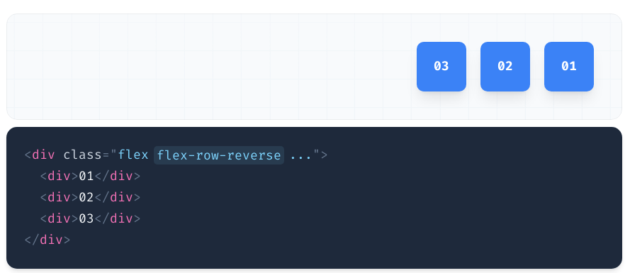
flex-row-reverse: This class is used to follow the opposite text direction. It makes flex items in reverse order exactly the opposite of text direction as we can see in the Output.
Syntax:
<element class="flex flex-row-reverse"> Contents... </element>
Use flex-row-reverse to position flex items horizontally in the opposite direction:


flex-col: It arranges the row as a column same as text direction but top to bottom. It is used to specify that the item has a normal top to bottom direction. It makes the item follow the normal top to bottom direction as we can see in the output.
Use flex-col to position flex items vertically:
Syntax:
<element class="flex flex-col"> Contents... </element>


flex-col-reverse: It arranges the row as a column same as row-reverse bottom to top. It is used to specify that the item has a normal bottom to top direction. It makes the item follow the normal bottom to top direction as we can see in the output.
Syntax:
<element class="flex flex-col-reverse"> Contents... </element>
Use flex-col-reverse to position flex items vertically in the opposite direction:


